
The Psychology of Graphic Design: How Colors and Fonts Influence Customers - Copy
Graphic design is more than just creating visually appealing content; it’s about understanding how design elements like colors and fonts influence human behavior and decision-making. The psychology behind these elements can evoke emotions, shape perceptions, and even drive actions. By strategically using the right colors and fonts, businesses can create designs that resonate with their target audience and strengthen their brand message. In this blog, we’ll explore how colors and fonts influence customers and how you can use this knowledge to enhance your designs.

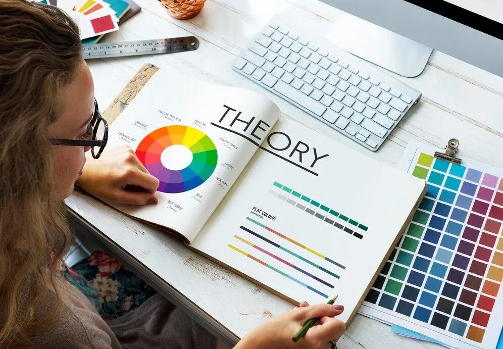
1. The Emotional Impact of Colors
Colors have the power to evoke emotions and set the tone for your brand. For instance, red is associated with energy and passion, often used to create urgency in sales campaigns. Blue conveys trust and professionalism, making it a popular choice for corporate brands. Yellow is uplifting and attention-grabbing, while green symbolizes health, growth, and sustainability. By understanding the psychology of colors, designers can create visuals that align with a brand’s identity and influence customer behavior.
2. Building Trust with Blue and Neutral Colors
Trust is a critical factor in customer decisions, and blue is the color most associated with reliability and stability. That’s why financial institutions, tech companies, and healthcare brands often incorporate shades of blue in their designs. Neutral colors like gray, white, and beige also convey professionalism and simplicity, helping brands appear dependable and honest. Combining these colors with clean, minimalistic designs can create a sense of trust and credibility.
3. Using Warm Colors to Evoke Energy and Action
Warm colors like red, orange, and yellow are highly stimulating and effective for grabbing attention. Red is commonly used in calls-to-action (e.g., “Buy Now” buttons) to create a sense of urgency. Orange is energetic and optimistic, often used for brands targeting younger audiences or promoting adventure. Yellow adds cheerfulness and positivity to designs, making it ideal for playful or friendly brands. These colors can drive engagement when used strategically.
4. The Role of Fonts in Personality and Perception
Just like colors, fonts play a significant role in shaping a brand’s personality. Serif fonts (e.g., Times New Roman) convey tradition, sophistication, and reliability, making them suitable for formal or luxury brands. Sans-serif fonts (e.g., Arial) are modern, clean, and approachable, often used by tech companies and startups. Handwritten or script fonts add a personal and artistic touch, ideal for brands emphasizing creativity or individuality. The choice of font sets the tone for your brand and influences how customers perceive your messaging.

5. Creating Visual Hierarchy with Typography
Fonts can also guide a viewer’s attention through the use of visual hierarchy. Designers use font size, weight, and style to emphasize key messages and create a logical flow in the content. For example, a bold and large headline immediately grabs attention, while smaller, lighter text is used for supporting details. Consistent use of typography helps viewers quickly grasp the main points of your design, improving communication and engagement.
6. Combining Colors and Fonts for Maximum Impact
The synergy between colors and fonts is what creates truly impactful designs. For instance, pairing warm colors like orange with bold sans-serif fonts creates a sense of energy and modernity. On the other hand, cool colors like green paired with elegant serif fonts convey professionalism and calmness. Designers carefully balance these elements to ensure they complement each other and reinforce the intended message. The right combinations can make your brand more memorable and visually appealing.
7. Aligning Design Choices with Target Audience
Understanding your audience is crucial when selecting colors and fonts. A younger audience might resonate with playful fonts and bright, vibrant colors, while a professional audience may prefer muted tones and traditional typography. Researching your target demographic’s preferences and cultural associations ensures your design choices resonate effectively. By aligning design elements with audience expectations, you can build stronger connections and foster loyalty.